While the initial euphoria and bewilderment around foldable smartphones has ebbed, the excitement is pretty much alive. After the innovation, it’s time for brands to grab the new tech by the horns and show us what we, the consumers, can do with it, and how it can help us improve our lives. This is why we’re seeing newer options in foldables now, and more brands jumping into the fray. Motorola is an old hand though, and its latest Razr 40 Ultra comes in as a follow-up to previous models in the Razr series… the same range which is a reincarnation of the company’s iconic clamshell that set tongues wagging and the markets abuzz back in the day. Apart from spec bumps, the newest model boasts tweaks and refinements, and a few world-firsts as well.
Verdict
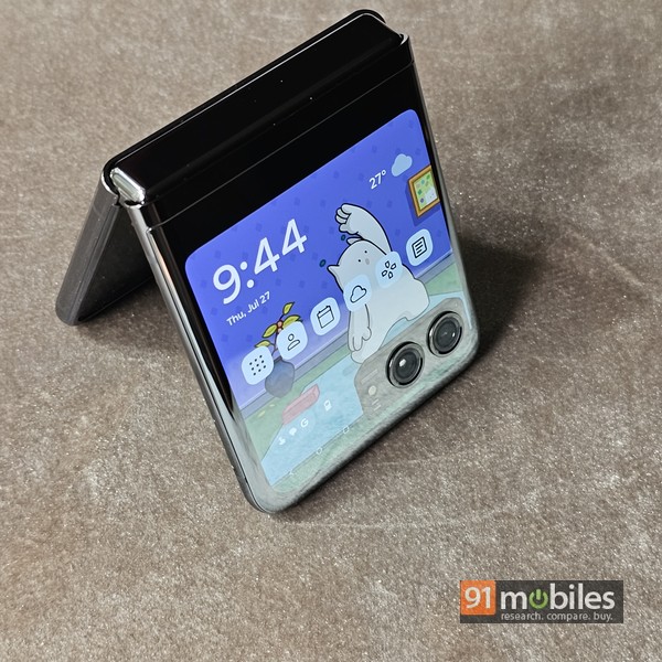
The Motorola Razr 40 Ultra is a standout device on the flip side of the foldable smartphone segment. While camera prowess isn’t its strongest feature and the wireless charging speeds are slow, the handset scores high on most other aspects like performance and software. It shines as far as design is concerned, and its large cover screen that can run most apps adds to the overall usability as well.Design and displays
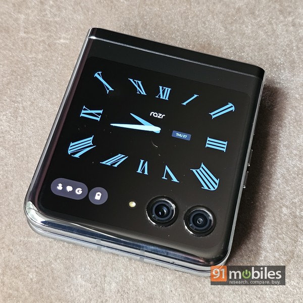
When it comes to a foldable smartphone, especially one that uses the flip form factor, the design has to be one of the main talking points. And I must say that Motorola has nailed it with the Razr 40 Ultra. This phone is really one of the sexiest, sleekest phones I’ve had the pleasure of using. Its design, slimness and rounded edges do make it a tad slippery. Worth adding that the hinge feels sturdy and is fairly stiff too, which means that the phone can stay open at any angle, and unless you resort to some deft hand movements and finger gymnastics, you would need both hands to open the flip. Most importantly, thanks to the type of hinge it uses, the Razr 40 Ultra doesn’t have any gaps visible in the middle when the phone is folded, and when opened, there’s barely any crease on the main display either. Everything just adds to the class it exudes. There’s IP52 rating too, indicating that the phone is resistant to splashes but you better not spill large amounts of liquid or use it in heavy rain.

The bottom half of the rear has a rich, satin feel, while the top sports a mirror finish. This portion is almost all-screen, despite the presence of the two camera rings. This cover screen is the largest I’ve seen to date on a foldable flip phone, measuring 3.6-inches and bearing 1:1 (square) aspect ratio. Furthermore, the cover screen even boasts specs better or at par with most main displays on other phones – it’s AMOLED, supports HDR10+, can go up to 1100 nits in terms of peak brightness, is covered with a layer of Gorilla Glass Victus and features a whopping 144Hz refresh rate. And even more impressive is the fact that the cover display can be used for almost anything, without any significant restrictions – more on that later.
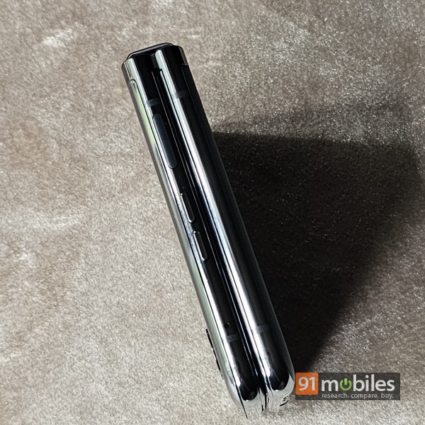
When unfolded, the Razr 40 Ultra’s rounded sides are just 7mm thick. The right spine holds a couple of discrete volume keys on top, next to a power key that integrates a fingerprint scanner. Worth mentioning that since the edge is rounded, the power key is small and also slightly curved, but despite that, the fingerprint scanner works fine. In fact, it’s quite accurate and fast.
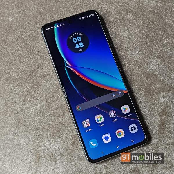
Opening the phone reveals the 6.9-inch foldable AMOLED display, which bears 2,640 x 1,080 resolution, 1,400 nits peak brightness and goes all the way up to 165Hz, on paper at least. The 10-bit panel supports HDR10+, features the tall 22:9 aspect ratio, and thanks to LTPO, can go down to 1Hz to conserve battery life. It’s a capable display too – it’s super smooth and responsive, and outputs vibrant colours.
Cover screen and usability

The Razr 40 Ultra’s cover screen deserves its own sub-section – it’s just that good. From the perspective of foldable smartphones which have two screens (which covers pretty much all commercially-available foldables so far, at least to my knowledge), the outer screens, or cover displays as they’re called, are vital to the product proposition. Size matters for sure, and also, what you can do on them. And the Razr 40 Ultra’s cover screen nails it in that respect – it’s not only the largest cover screen on a flip foldable I’ve tried, it’s also the most useful. You see, Motorola hasn’t imposed any major restrictions in terms of what you can do it.
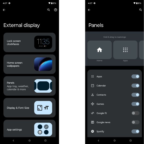
The cover screen’s UI is mainly divided into panels you can scroll through – comprising a home screen, contacts, apps, calendar, games, weather, Spotify, Google News etc. You can choose which panels you want displayed and hide the others, and there are some customisation options available as well. However, if you use any other music streaming app instead of Spotify, you might be a tad disappointed since the music panel only works for Spotify at the moment.
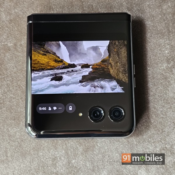
On the positive side, pretty much all apps and everything installed on the phone can work on the cover screen, whether it’s officially supported or not. The interface, aspect ratio etc aren’t optimised for all apps and games of course, so there’s a good chance you’ll find some UI elements broken. For messaging and email apps, the pop-up keyboard tends to cover almost the entire screen, restricting your view and affecting usability. Despite all these niggles, some of which can be alleviated by means of software updates I hope, the Razr 40 Ultra’s cover display is the most useful as compared to direct rivals available in the Indian market.
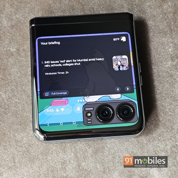
You can use the display to catch up on notifications, make and answer calls, shoot pictures and videos, run apps like Google Maps, play YouTube videos, reply to messages, play games – almost everything that can be done on the main screen, subject to the limitations imposed by the size, aspect ration and UI niggles I mentioned above. Heck, I’d go so far as to say that if your usage is basic, you can get by without having to open the flip at all, using just the cover screen for all your interaction with the phone.
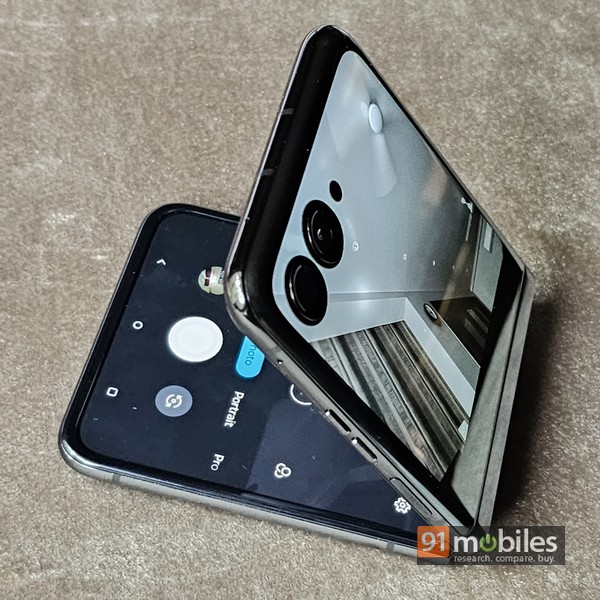
Diving into some more aspects of the ‘flipability’ and cover screen, the latter comes in handy for shooting pics and videos. It allows you to use the primary cameras to shoot selfies, lets the subject see a preview of the picture being shot, can be propped up partly open (laptop-style or in tent mode) for shooting sans a mount or tripod, and even allows one to hold the device camcorder-style to shoot whilst walking around. There’s a smile shutter option which makes clicking selfies fun too.
Cameras
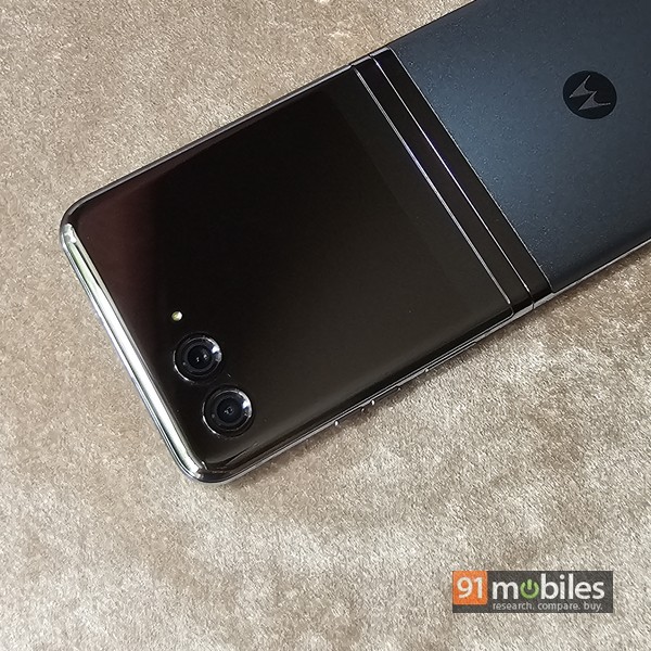
In terms of optics, the Razr 40 Ultra comes equipped with a 12MP primary camera with OIS, and a 13MP ultrawide. Then there’s the 32MP front snapper integrated into the centrally-aligned punch hole on the main display. The shooting modes include the usual ones like portrait, slow-mo, macro, pro, etc, while diving into “More” provides extra options like timelapse, dual capture for both stills and videos, spot colour for stills and videos, panorama, etc. The camera app interface running on the main screen also has the option to enable a preview on the cover screen simultaneously so that the person you’re shooting can adjust the frame as they want.
As you can imagine, the Razr 40 Ultra’s cameras aren’t extremely versatile, since there’s no dedicated telephoto sensor. Overall, the images shot in daylight look pleasing, though the colours appear a bit muted, and the dynamic range isn’t great. The ultrawide sensor manages fine as well, though it’s not significantly wider than the primary shooter. Low-light shots are okay, albeit lack detail, but the dedicated night mode helps quite a bit in livening them up. The front shooter does a fair job for selfies too, with reasonably good skin tones. 8x digital zoom is available, and that just about does the job, with expected loss in quality. Suffice it to say that cameras aren’t the Razr 40 Ultra’s strong point and in that respect, rival flip foldables from Samsung and OPPO can do a better job.
Software, performance, and battery
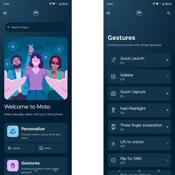
Motorola’s phones are known for their clean, bloatware-free, near-stock implementation of Android, and the Razr 40 Ulta sticks to the same approach. It runs Android 13 and includes tons of signature Motorola features that can come in quite handy. Apart from a plethora of customisation options, three-finger screenshot, and swipe to split, there’s stuff like Moto Secure that comprises secure folder and other useful security features. Then there’s the Moto app that includes gestures and features like attentive display etc. Quick launch for the camera and chop-chop actions to toggle the flashlight are features that we’ve come to appreciate over the years too.
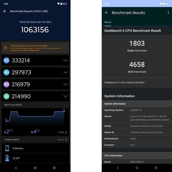
With the 4nm Snapdragon 8+ Gen 1 under the hood, along with 12 gigs of RAM and up to 512GB of fast UFS 3.1 storage, performance isn’t going to be an issue. The SoC might not be the latest flagship, but we all know it packs enough grunt and can handle any task with ease. The benchmark scores provide an indication of how fast it is, and real-life performance matches that as well. This isn’t meant to be a gaming phone, but it can handle graphics-intensive titles too, even though the slim form factor and the modest battery might not be ideal for this use case. Other than that, it flies and zips through apps with ease – so no complaints there.
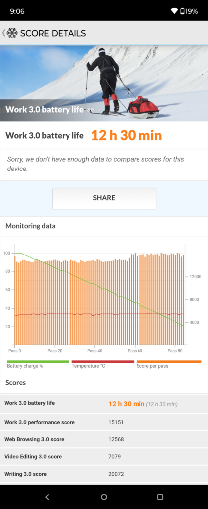
The 3,800mAh battery capacity seems modest relative to those of most smartphones available these days but isn’t too bad for a flip foldable. With light usage, you should be able to get a day’s worth, but otherwise, could find yourself looking for the charger by the end of the day. The PCMark battery test logged 12 hours 30 minutes, which is a reasonable score for this battery. The usage can vary drastically depending on how you use the cover display too. If you can manage your day without unfolding the phone frequently and just end up using the cover screen most of the time, you could squeeze more battery life out of it. The 30w wired charging solution can juice up the phone in a little over an hour, but the 5w wireless charging support is just too slow to be actually useful.
Final Verdict
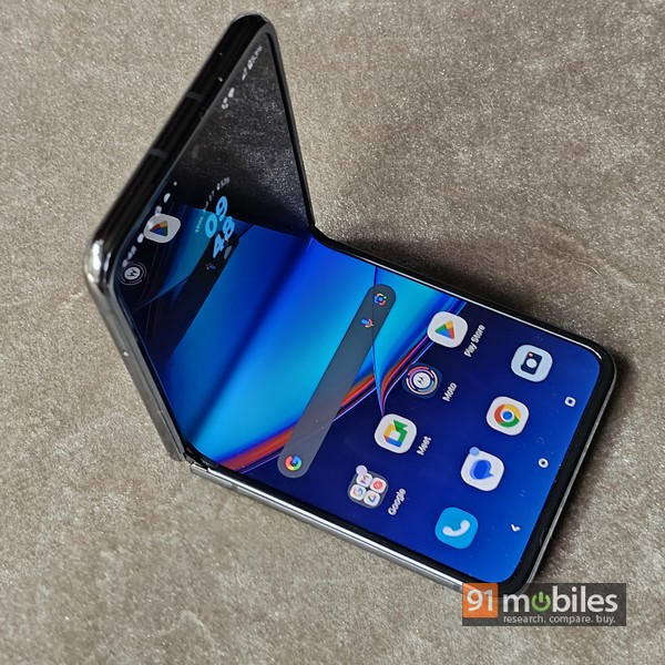
The Motorola Razr 40 Ultra is priced officially at Rs 89,999, though you might be able to snag it for a bit lower, and Rs 82,999 or thereabouts with bank offers etc. Direct rivals come in the form of the Find N2 Flip from OPPO (review) and the Samsung Galaxy Z Flip4 (review), with each of them offering slightly different capabilities in aspects like photography prowess, cover screen usability etc. The basic premise, however, stays the same. The real test for the Motorola Razr 40 Ultra will come in the form of the Galaxy Z Flip5, which has just been announced and is making its way to offline and online store shelves as you read this.
As things stand currently though, I like what Motorola has done with the Razr 40 Ultra, especially in terms of the design and the cover display. A few software tweaks that could potentially improve the camera capabilities could do wonders for it overall and make it even more compelling. Overall, it’s a phone that stands true to the flip foldable concept of style, flexibility and usability and delivers on most core aspects. If you’re eyeing a clamshell foldable smartphone, you’d do well to keep the Razr 40 Ultra near the top of your shortlist.
Editor’s rating: 7.5 / 10
Reasons to buy
- The Motorola Razr 40 Ultra looks quite sexy and exudes class
- The cover screen is large, and can run most apps
- The performance is smooth and fluid
- There are useful software features and hardly any bloatware
Reasons not to buy
- The Motorola Razr 40 Ultra’s cameras aren’t its strongest point
- The 5W wireless charging speeds are very slow
The post Motorola Razr 40 Ultra review: style, oomph and pizzazz, folded into one first appeared on 91mobiles.com.


0 Comments