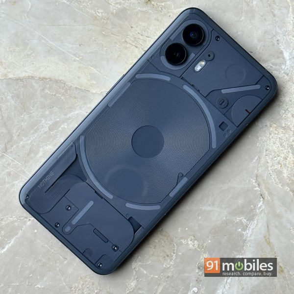
The Nothing Phone (2) borrows most of its design cues from its predecessor, and in fact, you’d be hard-pressed to make out the difference from a small distance. Now that I have that out of the way, let’s move on.
Nothing. What a beautiful, timeless, open-to-interpretation, and fortunately or unfortunately (depending on which way you look at it), pun-friendly name. Given its legacy and who started it, hype was a given from the get-go. Carl Pei is a bit of a legend in tech circles and ever since he announced the launch of his new electronics brand, Nothing has been grabbing headlines. The devices we’ve seen so far – from its debut product, the Nothing Ear (1), to the brand’s first smartphone, the Nothing Phone (1) (review) – have all stood out for various reasons, but most of all for their designs. And the successor that comes in the form of the Nothing Phone (2) does have big shoes to fill.
Verdict
The Nothing Phone (2) looks similar to its predecessor in terms of design but comes with improvements in almost all aspects — performance, display, battery, charging speeds, software, etc. The much-hyped Glyph LEDs have been upgraded too, both in terms of hardware and software, and are now more customisable, functional and usable. The Glyph UI also features third-party app integration with services like Uber and Zomato, and hopefully the brand will add more functionality going forward. The Phone (2) seems priced on the higher side if pure specs are taken into consideration, and the camera could do with a few improvements, but if the Glyph UI and the design appeals to you, it could prove to be a worthy buy.
Glyph interface
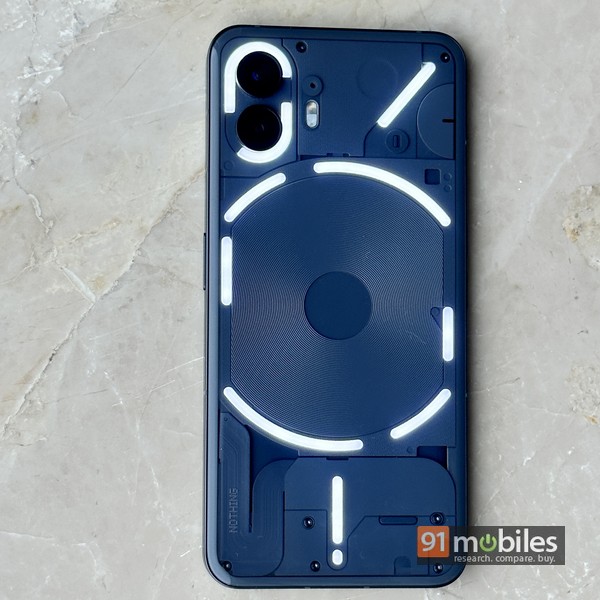
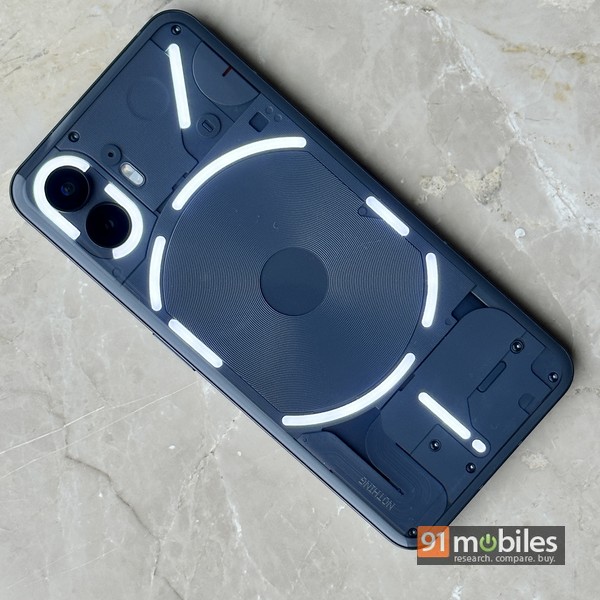
Let’s start with the most standout aspect of the Phone (2). Nothing’s signature LED lighting system. Glyph interface, as the brand likes to call it, has received a bunch of upgrades and new features this time around. Of course, most of the older features, like the ability to set custom combinations of lights and ringtones for specific contacts, ‘Flip to Glyph’ that mutes sounds when the phone is kept face down and activates light-only notifications instead, the charging metre, Glyph torch etc, are still there.

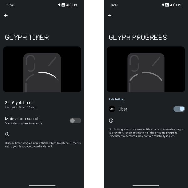
One of the most noteworthy additions to Glyph this time, at least in my opinion, is the auto brightness sensor. On the Phone (1), I found the LEDs too bright to use in dark environs like movie theatres, but the new ambient light sensor on the back of the Phone (2) dims the Glyph brightness automatically. You can still dive into settings and set the Glyph brightness manually if you want. Another interesting feature dubbed Glyph Progress converts one of the bigger LEDs to a progess indicator, integrating with apps like Uber and Zomato to show the time remaining for booked rides and food orders. The same thing works for timers as well (pictured above). Worth mentioning that the Glyph LEDs now have 33 individually addressable zones, so the system is more flexible and more customisable than before. There are some small bugs though. The volume indicator didn’t work for me, for example, but my review device is an early sample and I’m sure the retail units won’t have such issues… so I’m willing to give it the benefit of doubt.
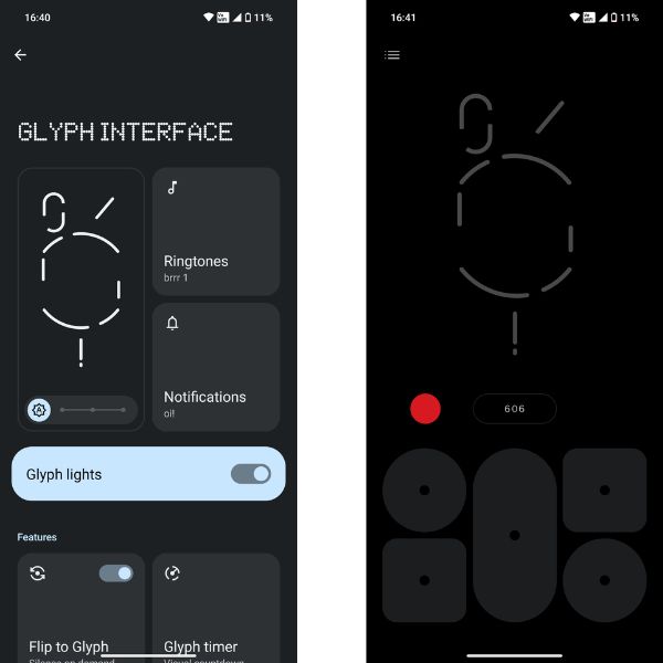
Next, there’s a new Glyph Composer (found under settings), that allows you to set your own sound-light combinations and save them as presets. This means you aren’t limited to the combinations provided by Nothing anymore, but if you do want to stick to those, you’ll find that there are 10 new ringtone options that have been added this time. Additionally, the Glyphs can also work as indicators for volume, reverse charging, and can be disabled as per specified bedtime schedules, etc.
Nothing is positioning the Glyph interface as a new way to interact with the phone, and also something that could potentially help if you’re “craving more me-time and less screen-time”. While it might be a few notches short of being a new means of interaction, the improvements to the Glyph interface on the Phone (2) are definitely a step in the right direction and add more customisability and functionality as well. Third-party app integration is welcome too, and hopefully, Nothing will figure out more ways to make it more useful in the future. And there’s no two ways about it – the Glyphs do add pizzazz, and work as head turners and conversation starters. If nothing else, you can use the Glyphs as a fancy torch and even as a portable ring light… with the latter being another new feature, and included with the flash option in the camera app.
Design and display

Design was one of the mainstays of the Nothing Phone (1), and at first glance, it seems not much has changed with the successor. A closer look at the Phone (2) however, reveals the gently-curved back and subtle changes in the rear panel 3D design. Thanks to the larger display, the footprint is a tad bigger than last time, and the phone is marginally thicker and heavier as well. The aluminium frame, however, is slightly slimmer than before due to the new curved design. The latter makes the Phone (2) a wee bit more slippery in the hand, though it must be said that the in-hand feel is slightly better, and the curves make it seem somewhat more premium too. The pair of camera rings on the back, which were silver on the Phone (1), are now black.

Port placement remains the same – so you get discrete volume keys on the left and the power button on the right, with the bottom housing the SIM tray, Type-C port and speaker.
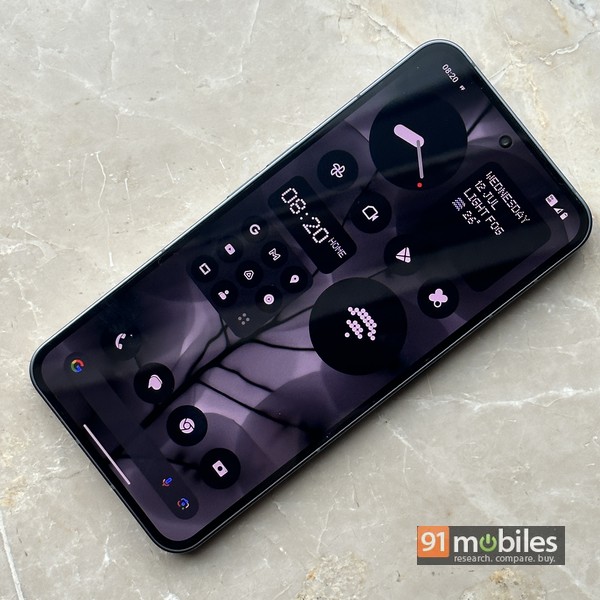
Up front is a 6.7-inch (as against 6.55-inch previously) 10-bit AMOLED display with 2,412 x 1,080 pixel resolution. The LTPO tech can variate the refresh rate between 1Hz and 120Hz, and the screen can go up to 1600 nits in terms of brightness. HDR10+ is supported and you also get Widevine L1 for streaming HD content. It’s a nice and capable display no doubt, with vibrant colours and punchy visuals – so no complaints there. A layer of Gorilla glass helps keep minor scratches at bay, and a fingerprint scanner is embedded underneath.
Cameras

Like most other aspects of the device, the cameras on the Phone (2) have received upgrades too, and the main snapper now uses a 50MP, 1/1.56-inch Sony IMX890 sensor featuring an aperture of f/1.88, OIS, and EIS, along with Advanced HDR that captures eight frames of a scene with different levels of exposure to put together the final image. It’s supposed to work with Night mode as well. The main shooter is mated to a 50MP Samsung JN1 ultra-wide sensor with f/2.2 aperture, while the front camera has been bumped up to 32MP (versus 16MP on the previous model). Videos can be shot up to 4K at 60fps, and there’s an Action mode available as well. Shooting modes for photos include the usual like slo-mo, time-lapse, portrait, macro and expert, and also a 2X Super-Res mode.
In a nutshell, the camera quality is good – you get pleasing results in almost all scenarios, with high saturation so you end up with vibrant, slightly boosted colours, especially in daylight. Nighttime shots are good too, and the night mode brings a subtle difference. There are some issues with scenes that have varying degrees of light and shadows, where the images end up looking a bit flat and the dynamic range could be be better I think. Portrait shots look good, and so do selfies, especially the ones shot in ample ambient light. It’s a capable camera system overall, but one that could do with some tweaks to take it to a level that can match the overall premiumness of the device.
Software

Overall, the UI is clean, and refreshingly different from other Android skins out there, impacting the usage experience positively.
Performance and battery
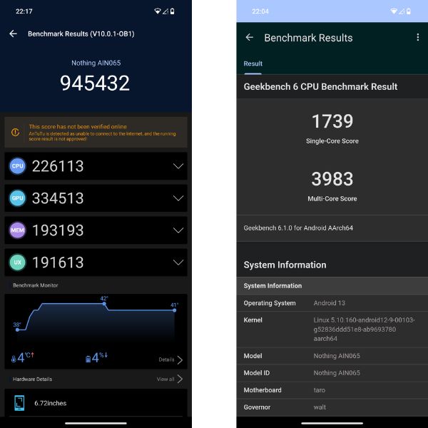
While its predecessor was decidedly a mid-rung offering in terms of its processing hardware, the Phone (2) has upped the ante and shifted gears to a near-flagship grade SoC. Thanks to the tried-and-tested Snapdragon 8+ Gen 1 under the hood, the phone can deliver smooth performance across the board for a variety of different apps and use cases. Up to 12 gigs of RAM aids in the performance and multi-tasking, and apart from the 128GB and 256GB storage versions, you also have the option of choosing a 512GB variant this time.

The 4,700mAh battery is a good performer, though if you’re an extremely heavy and demanding user, you might find yourself looking for the charger by late evening. PCMark’s battery test logged over 16 hours of runtime to drain the battery from full to 20 percent – a solid result. Speaking of looking for the charger, you better have your own or buy a new one, since Nothing doesn’t provide anything in the box. Charging speeds aren’t the best either, with support for 45W wired charging takes a little over an hour to juice up the phone fully. You do get support for wireless charging (15W), and thanks to reverse wireless charging, you can even juice up other devices like Nothing’s own Ear (2) using the phone.
Other hygiene aspects like the stereo speakers, 5G connectivity, in-display fingerprint scanner, face unlock, etc, work as expected — no complaints there.
Final verdict

At a starting price of Rs 44,999 for the 8GB/128GB variant, going up all the way to Rs 54,999 for the 12GB/512GB version, the Nothing Phone (2) could be a tough sell and might not be for you if you’re a spec fiend. Let’s face it – it’s not really the best in its segment in terms of core aspects like performance, camera and charging speeds, given its asking price. If you don’t appreciate the Phone (2)’s design language or the Glyph LEDs, the new device might not appeal to you. Those looking for a capable all-rounder and value could find the iQOO Neo 7 Pro (review) a better buy, coming at a much lower price too. And closer to Phone (2) territory, the OnePlus 11R (review) is another strong contender.

The Nothing Phone (2), in a similar fashion as the Phone (1), is a bold choice. It’s for you if you want to make a statement and stand out from the herd, and buy into Carl Pei’s philosophy. It’s a step up in comparison to its predecessor, coming as a more capable, more refined version. It might look similar but offers upgrades in almost all key areas, with the phone’s software and Glyph interface being especially notable. The similar design has its benefits – it might not attract existing Nothing phone users, but it’s still new for others, and potentially opens up the doors for those who held back the first time. And for that, it scores a few extra points in my book.
The Glyph interface, if you use it the way its makers want you to, aims to bring about a shift in your smartphone usage… though I would still shy away from saying it’s a game-changer in terms of interacting with your phone. The promise and potential is there though. The newer Glyph capabilities like auto-brightness and functionality like the progress indicator and integration with third-party apps do point to a brighter future, no pun intended. So is the Nothing Phone (2) perfect? Nope. Is it a capable phone? Sure. Should you buy it? Not if you don’t see yourself using the Glyphs. Existing Nothing Phone (1) users would probably stay away too. But if you think the premium is justified for a design that could be on its way to becoming iconic, helping you get attention or delivering on the less-screen-more-me ideology, the Nothing Phone (2) could just be the one.
Editor’s rating: 4 / 5
Reasons to buy:
- The design is still special and helps you stand out.
- Upgrades to the Glyph LEDs make them more customisable, practical and usable.
- Core aspects like performance, battery life, and cameras are good.
- The Nothing OS 2.0 UI is free of bloatware and quite customisable.
Reasons not to buy:
- The cameras aren’t best in class.
- The charging speeds, while an improvement as compared to the previous model, can’t match rivals.
- Some might not appreciate the similarities between Phone (2) and Phone (1) design.
- Those weighing specs against price would find the cost high.
The post Nothing Phone (2) review: en route to iconic status? first appeared on 91mobiles.com.

0 Comments